Yumi
Rediseñar el logotipo y envases de Yumi Snacks. Para esta marca nos enfocamos en proyectar frescura con un toque divertido y comercial, es por ello que el ícono del logo simula una papa y al mismo tiempo, una sonrisa de manera abstracta.
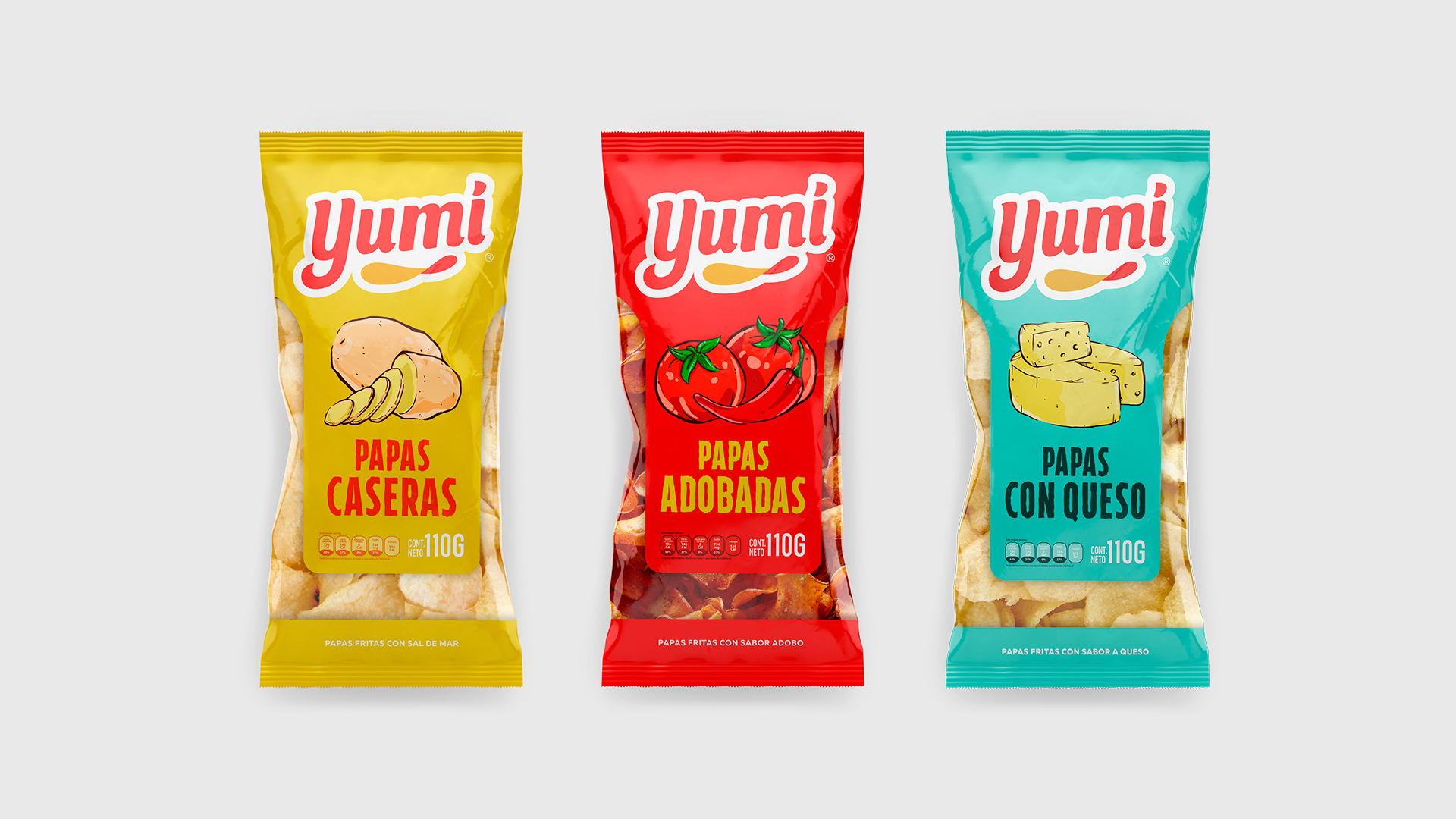
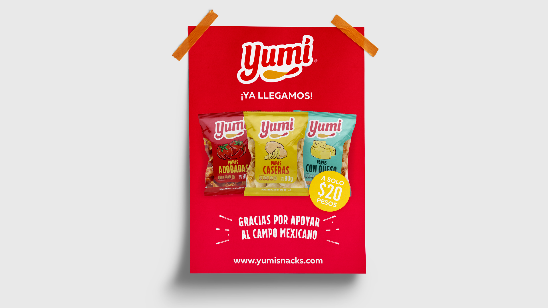
Diseñamos un empaque limpio y fuerte para ayudarnos a posicionar esta nueva marca en el mercado de los snacks. Optamos por el uso de una ventana para mostrar la calidad de papa que se usa, además de proyectar frescura y confianza. El manejo de colores e ilustraciones nos ayuda a diferenciar la gama de productos disponibles.
Para nosotros y nuestro cliente, era importante destacar que es una marca 100% mexicana, es por ello que en toda su imagen de POP se destaca la frase “Gracias por apoyar al campo mexicano”, en honor a las manos que lo trabajan y quienes hacen posible que exista este producto de excelente calidad.
–
We redesigned the logo and packages for Yumi Snacks. For this brand, we wanted to focus on projecting freshness with a funny and commercial touch, that’s why the icon acts as a chip and at the same time as an abstract smile.
We designed a strong and clean package to helps us position this new brand on the snacks market. We opted for the use of a window to demonstrate the quality that is used for the potato chips while also reflecting freshness and trust. The management of colors and illustrations helps us differentiate the range of available products.
For us and our client, it was important to highlight that its a 100% Mexican brand. That is why in all of its Point of Purchase images, the phrase “Thanks for supporting the Mexican field” is emphasized in honor of the hands who work it and makes the existence of this quality product possible.