Nami Sake
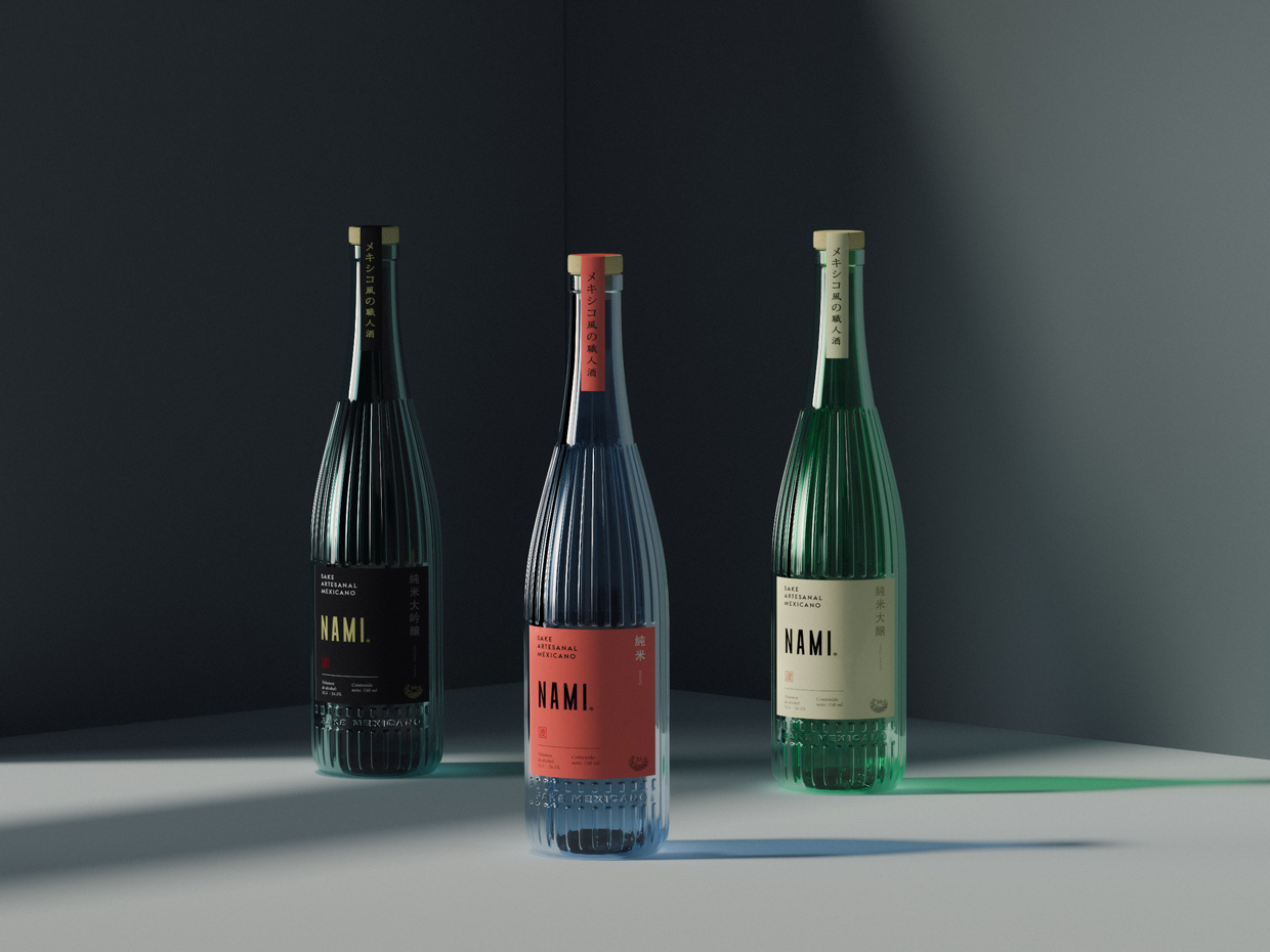
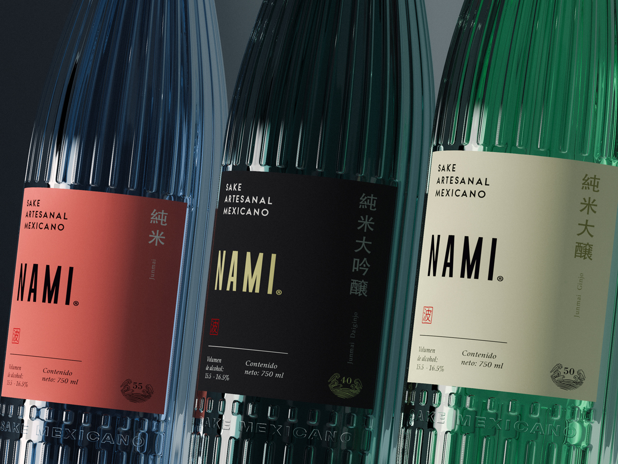
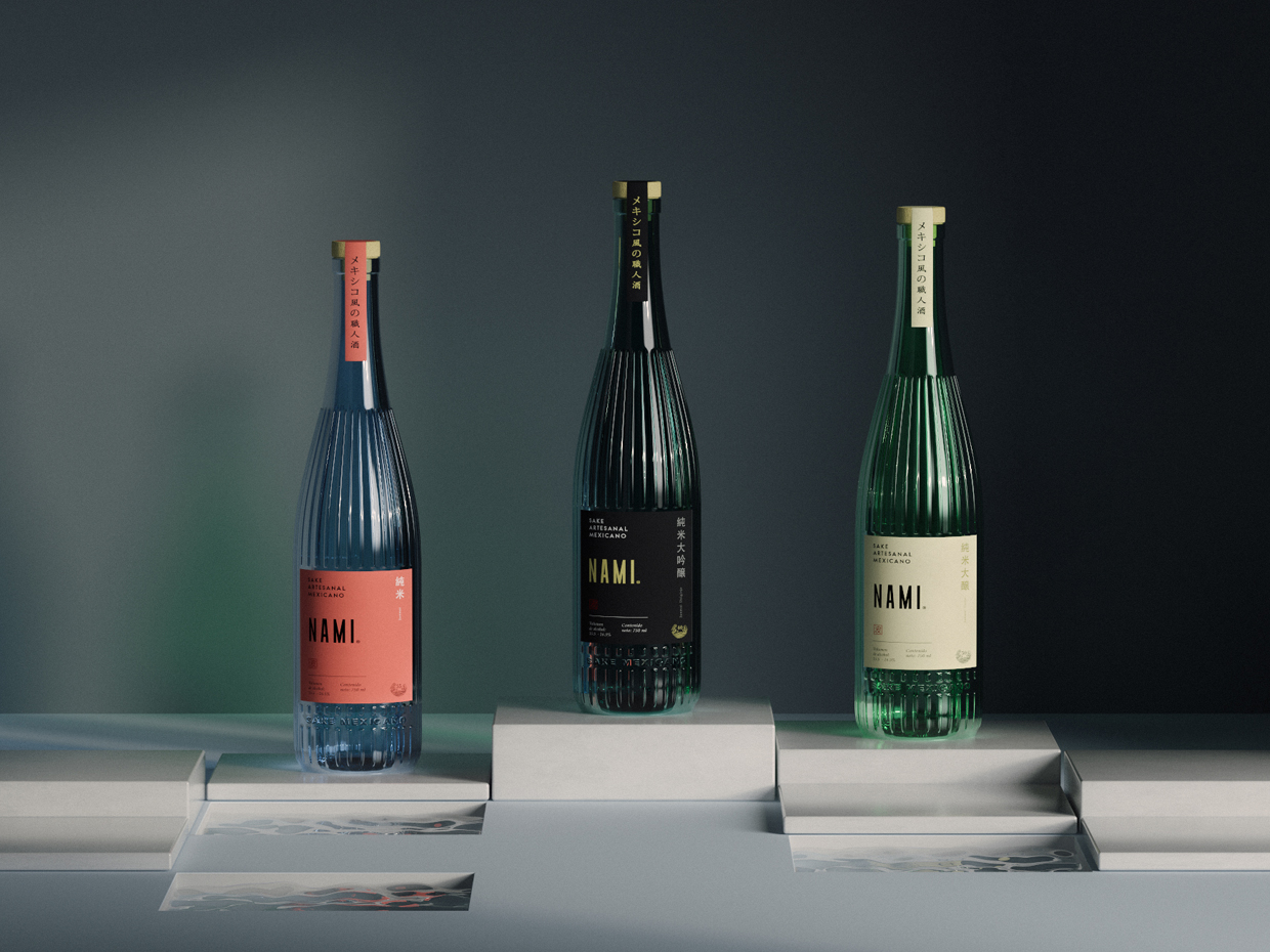
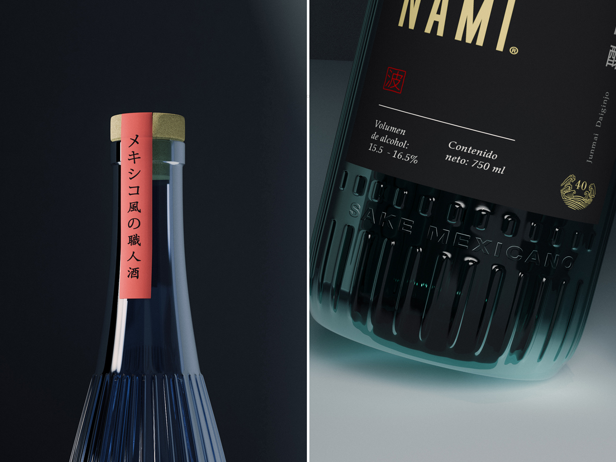
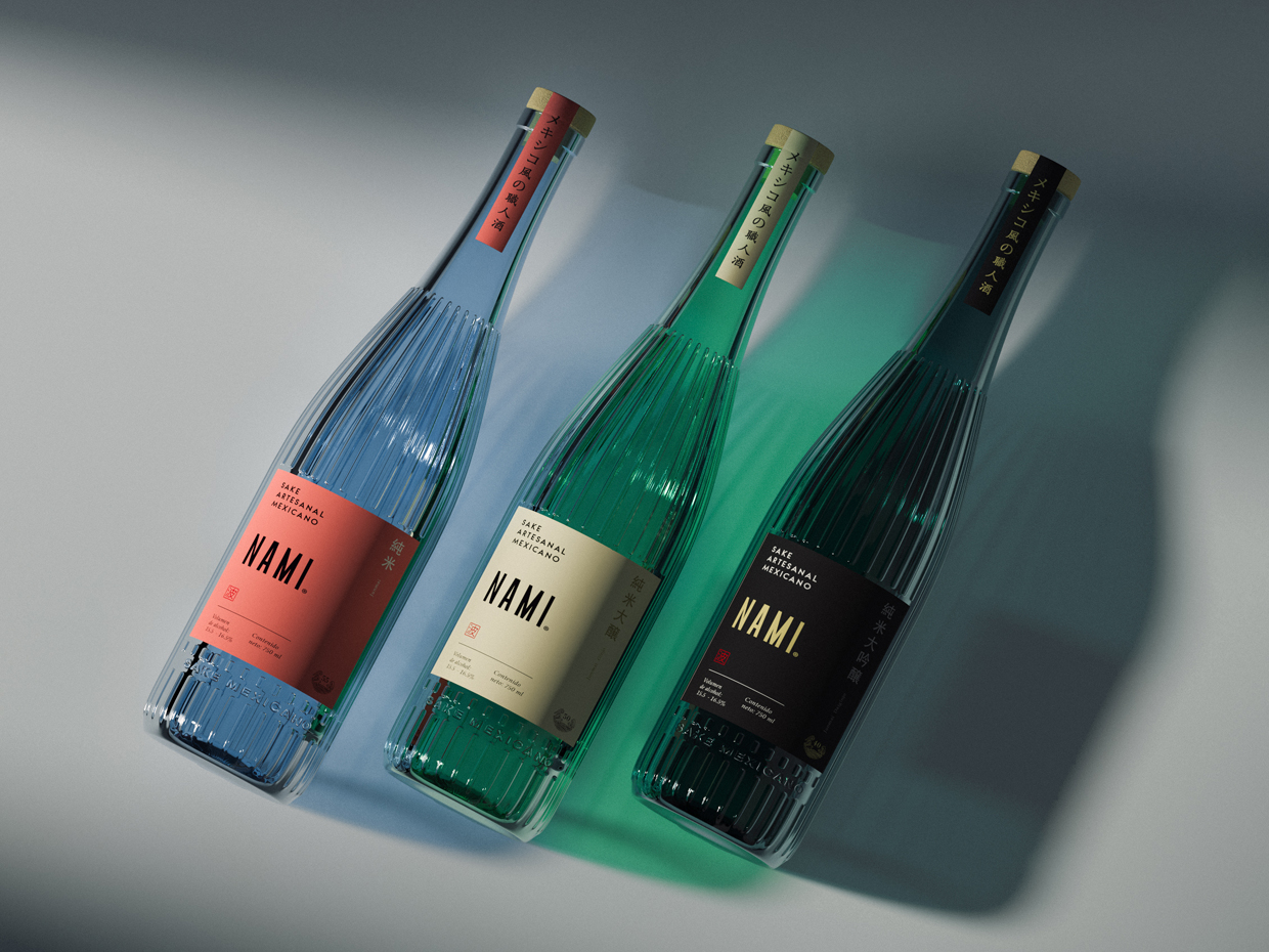
Tuvimos el honor de diseñar la primer edición de NAMI® “El primer Sake Mexicano” por lo que fuimos invitados a llevar a cabo el concepto para su segunda edición. En esta nueva propuesta diseñamos el embalaje (Botella de vidrio) y etiqueta buscando hacer una fusión de los conceptos Japón + México. En la botella representamos la utilización de lineas con relieve que simulan la geometría de los barriles de madera en los que se fermentaba el sake en la antigüedad, así mismo dividimos los distintos niveles de pulimento de arroz por categoría de colores inspirados en una gama alegre con toque mexicano.
Este rediseño busca presentar al sake de una manera innovadora en la cual el consumidor mexicano que no está acostumbrado a ingerir este tipo de bebida se sintiera invitado a degustar y experimentar nuevos sabores, es por esto que cambiamos el lenguaje de las botellas tradicionales de sake rompiendo con el tabú que hay detrás del mismo en cuanto a que es una bebida fuerte, esto se logró mediante la utilización de una botella semi transparente lo que le da una sensación de ligereza al mismo tiempo que la lleva a un entorno de competencia con otras categorías como el Gin, Tequila y Mezcales.
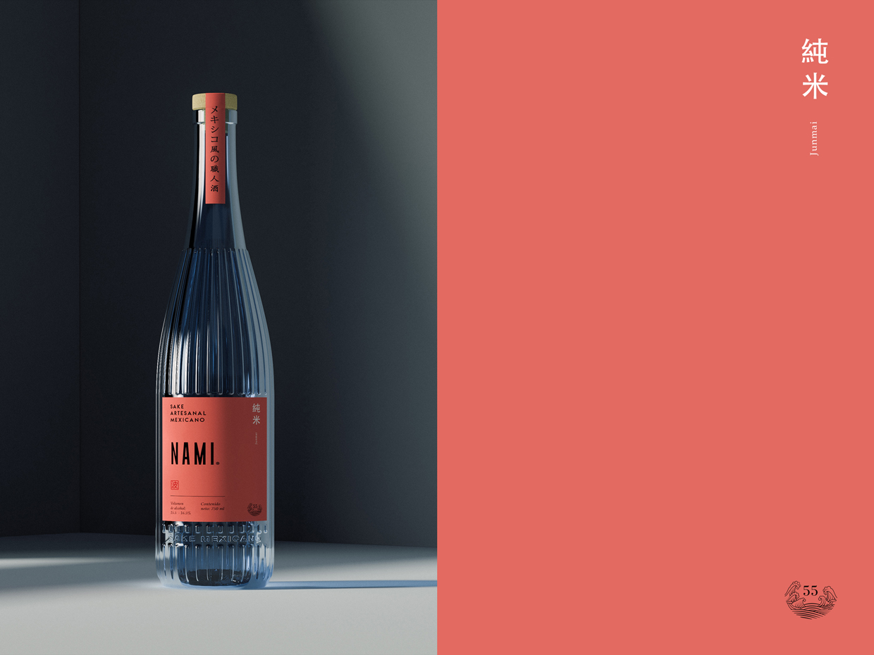
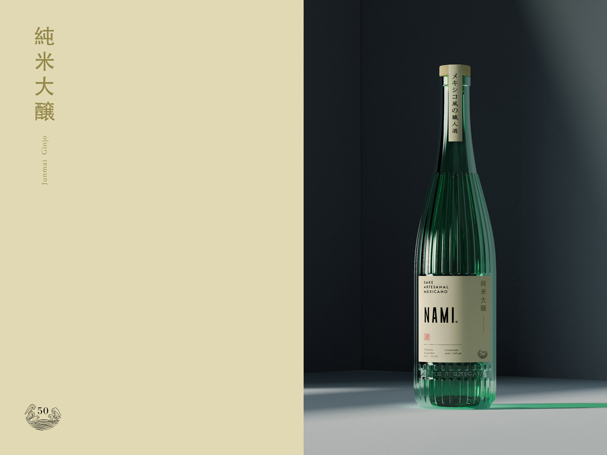
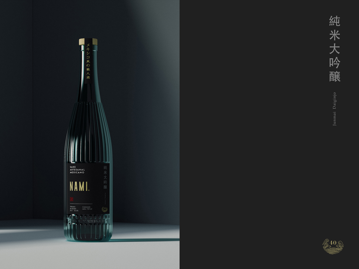
NAMI® Sake se divide en tres categorías o calidades de sake que son definidas en base al nivel de pulido del arroz. Para distinguirlas utilizamos 3 pigmentaciones de cristal distintas y 3 colores de etiqueta que combinan a su vez con el cristal. Jumnai se representa con un color de cristal azul y etiqueta rosa mexicano seguido por Junmai Ginjo el cual utiliza un verde bandera en el cristal contrastado por un beige en el cuerpo de etiquetado y finalizamos con la categoria premium Junmai Daiginjo por un cristal oscuro y etiqueta negra con toques dorados que le dan ese feeling clásico.
—
We had the honor of designing the first edition of NAMI® “El primer Sake Mexicano” and recently we were invited to make a whole new concept for their second edition. In this new proposal we designed the packaging (Glass bottle) and the label, aiming for a fusion between two different concepts: Japan + Mexico. For the bottle design we incorporated raised lines in the glass to portray the characteristic geometry of the wooden barrels that were used in old Japan to fermentate Sake. In addition to it we separated the different levels of rice polishment by a beautiful spectrum of mexican color categories.
This redesign is looking to present Sake in a innovative way which the mexican client is not used to consume this type of drink and would feel invited to taste it and experience new flavors, this is why we changed the language of the traditional Sake bottles, breaking the taboo behind it as a strong drink, we reached this through a semi transparent bottle which gives the sense of lightness and at the same time is competing with other categories such as Gin, Tequila and Mezcals.
NAMI® Sake is divided into three categories or qualities of sake that are defined based on the level of polish of the rice. To distinguish them we use 3 different crystal pigmentations and 3 label colors that match the glass. Jumnai is represented with a blue crystal color and mexican pink label followed by Junmai Ginjo which uses Mexico’s flag green on the glass contrasted by a beige on the labeling body, and we finished with the premium category Junmai Daiginjo with a dark crystal and black label with golden touches that give it that classic feeling.