Los Arcos
Restaurant Los Arcos decide después de 40 años renovar su marca para conquistar nuevas generaciones.
Mediante un análisis de marca se concluye que el logotipo tiene detalles gráficos regionales los cuales son difíciles de digerir culturalmente en el mercado nacional, sobre todo si no se conoce la historia y lugar de origen del restaurante.
No solo era necesario renovar el logotipo, sino también la experiencia física de la marca: desde los menús y la fotografía hasta la personalidad de marca. En el ámbito digital, se diseñó el sitio publicado en 2015 como parte integral de la experiencia de marca, así como la comunicación interna, con el objetivo de transmitir empatía y actualidad en el mercado.
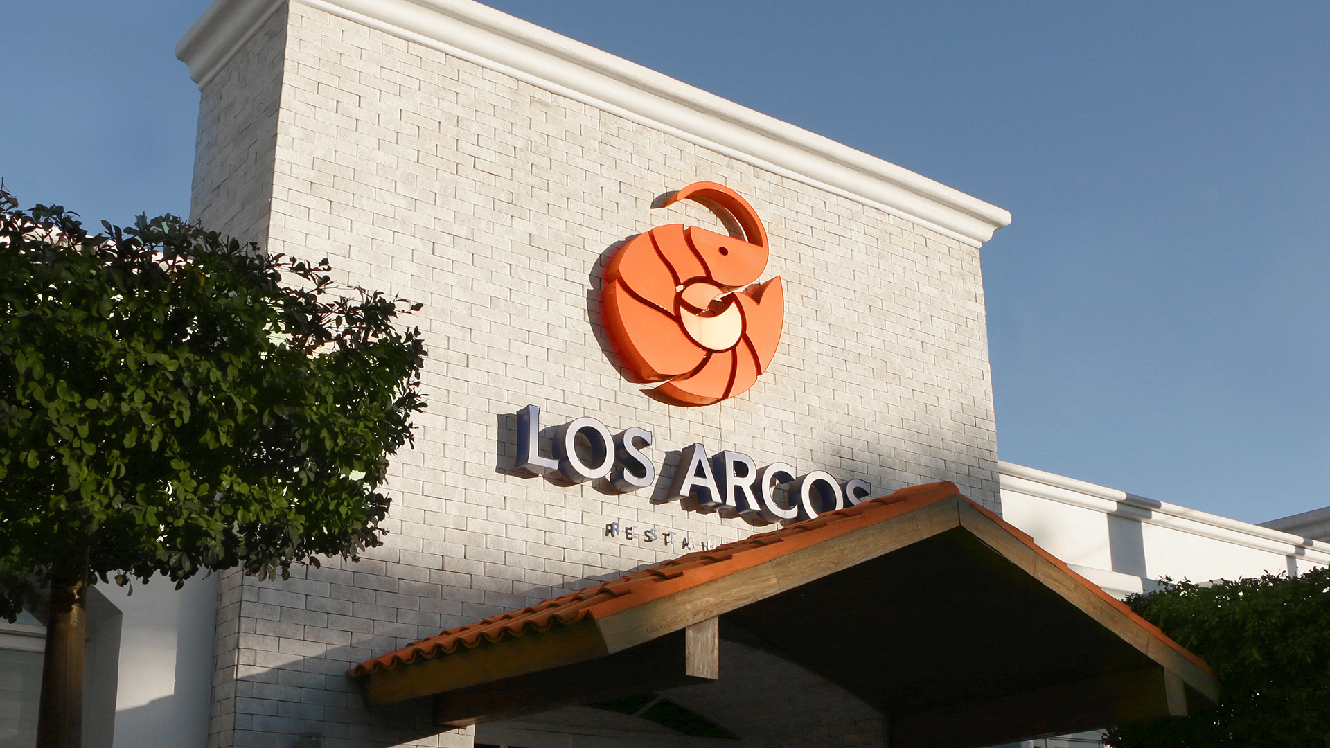
Decidimos volver al origen e inicios de la marca para escribir una nueva historia. El rediseño del logotipo se inspiró en la forma natural del camarón, producto estrella de Los Arcos, volviendo a una posición natural enroscada que proyecta nacimiento y evolución.
–
Los Arcos restaurant decides after 40 years, to renew its brand to conquer new generations.
Through an analysis of the brand, it’s concluded that the logo has regional graphic details that are difficult to understand culturally in the national market, especially if you don’t know the history and place of origin of the restaurant.
Not only was the logo in need to be renewed, but the physical experience of the brand, like the menus, photography, brand personality, and intern communication, to achieve transmitting empathy and actuality on the market.
We decided to return to the origin and beginnings of the brand to write a new story. The redesign of the logo was inspired by the natural form of the shrimp, the star product of Los Arcos, going back to a natural position that projects birth and evolution.