
Packaging

Cham

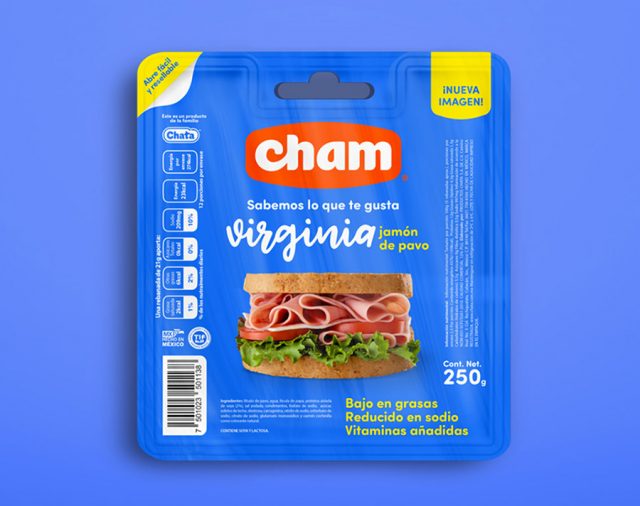
Productos Chata decidió rediseñar su marca de carnes frías Cham para dirigirse a un mercado más joven y diferenciarse en anaquel.

Analizando el comportamiento de compra de las nuevas amas de casa, llegamos a la conclusión que el tiempo es lo más valioso que tienen y desean dedicar el menor tiempo posible a las compras del hogar.

Decidimos simplificar toda la marca iniciando por el logotipo, enfocándonos en su legibilidad y aplicación en cualquier producto para generar de forma más rápida su posicionamiento. En el diseño de empaques decidimos ser muy objetivos y claros para dejar lucir los atributos del producto y un ambiente agradable donde se desenvuelve la marca.

Para su comunicación creamos el slogan “Sabemos lo que te gusta”, posicionando a la marca como conocedora de los gustos de su mercado, por consecuencia produce y diseña sus productos a la medida de su consumidor.

Chata products decided to redesign their brand of cold meats Cham to target a younger market and differentiate into the shelf.

Analyzing the buying behavior of new housewives, we came to the conclusion that time is the most valuable thing they have and they want to spend as little time as possible on home purchases.

We decided to simplify the entire brand starting with the logo, focusing on its readability and application in any product to generate in a faster way their positioning. In the packaging design, we decided to be very objective and clear to highlight the attributes of the product and a pleasant environment where the brand unfolds.

For their communication, we created the slogan “We know what you like” positioning the brand as knowledgeable of the tastes of its market, consequently produces and designs its products to the size of its consumer.
Gamecraft

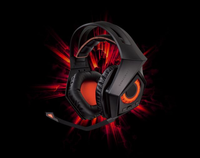
Coppel decide lanzar al mercado su marca propia de productos y accesorios para gamers.

El concepto fue desarrollar una marca que hiciera alusión a los mundos que existen en los videojuegos “el real y el virtual”.

Comunicando fuerza, pasión y ficción logramos empatía con nuestro mercado y un vínculo fuerte con su forma de pensar y sus hábitos de juego.

Basados en la simbología de rangos militares creamos un ícono sólido que a su vez se ramifica inspirado en las líneas que trazan los circuitos electrónicos formando unas alas con un aspecto digital.

Creamos un wordmark con trazos rectos que proyectan fuerza y simplicidad a la marca.

Desarrollamos el slogan “Haz equipo” el cual cumple con dos intenciones: Competir y crear comunidad.

Diseñamos toda la línea de empaques para lograr comunicar los principios mencionados en cada una de las apariciones de la marca en anaquel.

Coppel decides to launch its own brand of products and accessories for gamers.
The concept was to develop a brand that made an illusion to the worlds that exist on videogames “the real and the virtual”

Communicating strength, passion, and fiction we achieved empathy with our market and a strong bond with their way of thinking and their gaming habits.

Based on the symbology of military ranks we created a solid icon that in turn branches inspired by the lines that trace the electronic circuits forming wings with a digital appearance.

We created a wordmark with straight strokes that project strength and simplicity to the brand.

We developed the slogan “Make team” which fulfills two intentions: to compete and create community.

We designed the whole packaging line to communicate the principles mentioned in each of the appearances of the brand on the shelf.

Agua Histórica

Desarrollar una marca premium de agua natural y mineralizada dirigida al mercado de bebidas alcohólicas de alto valor.

Detectamos que el mercado al que se dirige la marca reconoce el tiempo y la trayectoria de los productos de calidad. La estética es muy importante ya que los productos líderes en el mercado manejan un arte elaborado y estilizado.

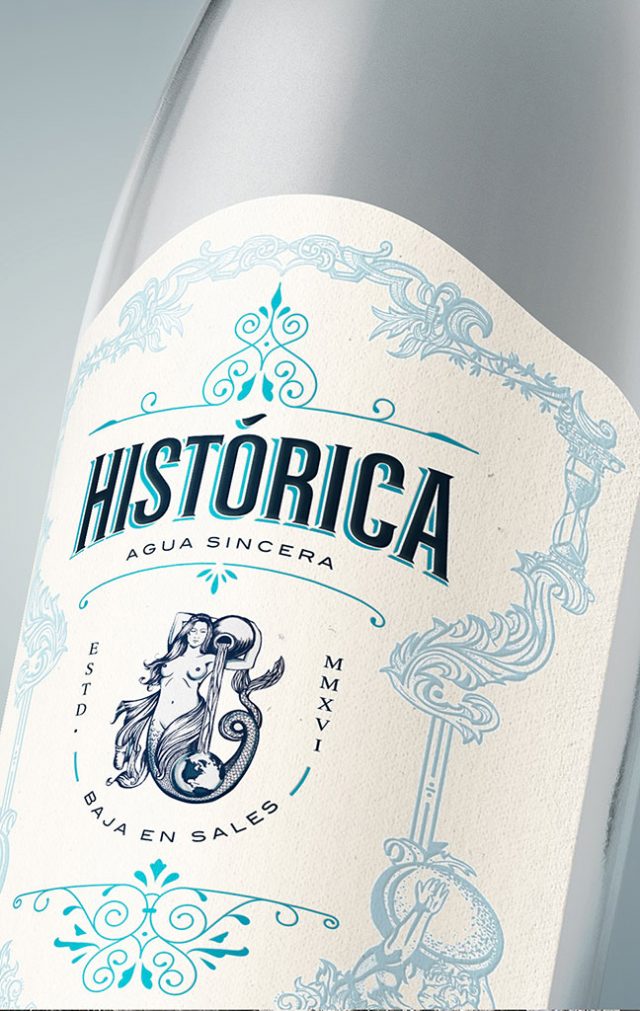
Llamamos a la marca HISTÓRICA, para lograr posicionar al producto desde su primera aparición en anaquel. Justificamos el nombre y el arte de la etiqueta creando un personaje que representa a la mujer de Atlas, figura mitológica que sostiene al mundo.

Histórica es una sirena apasionada por la pureza y energía del agua en el universo.

Develop a premium brand of natural and mineralized water aimed at the high-value alcoholic beverages market.

We detected that the market the brand is targeting recognizes the time and trajectory of quality products. The aesthetic is really important since the leading products in the market manage an elaborate and stylized art.
We named the brand HISTORICA, to achieve a place in the market from its first appearance on the shelf.
We justify the name and art of the label by creating a character that represents the woman of Atlas, a mythological figure that sustains the world.
Historica is a mermaid passionate about the purity and energy of the water in the universe.

Cerveza Pariente

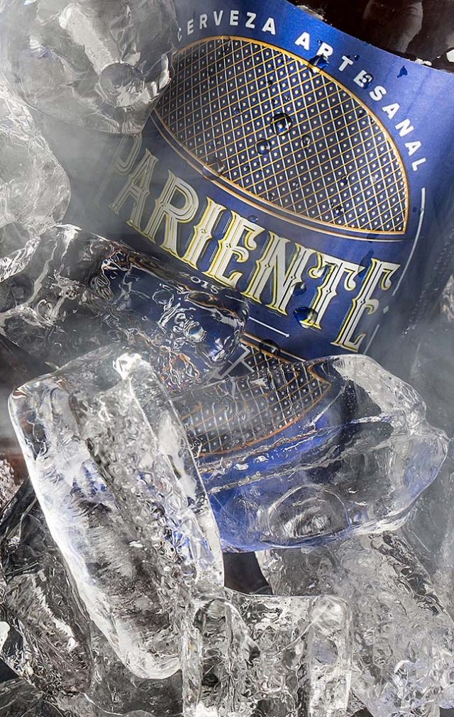
Crear una marca de cerveza artesanal con mucho arraigo regional.

Trabajamos en la creación de un nombre que se identificara en la cultura colectiva Sinaloense en el ambiente social y bohemio.

Se desarrolló la identidad visual del logotipo y etiqueta con un concepto elegante y clásico para contrastar el concepto final del producto, logrando comunicar distinción y empatía en su consumo.

Create a craft beer brand with a lot of regional roots.

We worked in the creation of a name that identifies with the collective culture of Sinaloa in a social and bohemian environment.
The visual identity of the logo and label was developed with an elegant and classic concept to contrast the final concept of the product, managing to communicate distinction and empathy with its consumption.

Hip Water

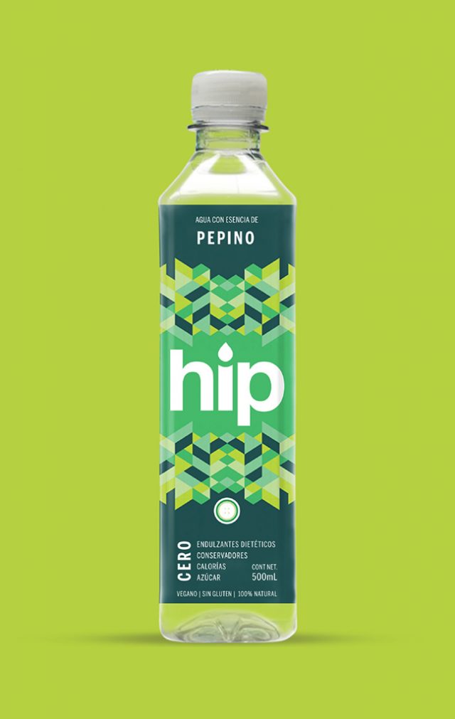
Un nuevo producto en el mercado, agua 100% natural con fusión de frutas sin endulzantes dietéticos, conservadores, calorías y azúcar que desea atacar al mercado de hábitos relacionados con la buena alimentación y ejercicio.

Los consumidores de este tipo de productos son muy visuales, honestos y buscan practicidad en su vida y en los productos que consumen.

Creamos un nombre corto y logotipo amigable, que proyecta frescura. Decidimos intervenir las etiquetas con patrones modernos inspirados en las frutas. Utilizamos transparencias en etiqueta proyectando sinceridad y protagonismo en los colores.

A new product in the market, 100% natural water with fruit fusion without dietary sweeteners, preservatives, calories, and sugar that want to attack the market habits related to good diet and exercise.

The consumers of this type of product are very visual, honest and look for practicality in their lives and in the products they consume.

We created a short name and a friendly logo that projects freshness. We decided to intervene in labels with modern patterns inspired by fruits. We used transparencies on the label projecting sincerity and prominence in colors.

Pawer

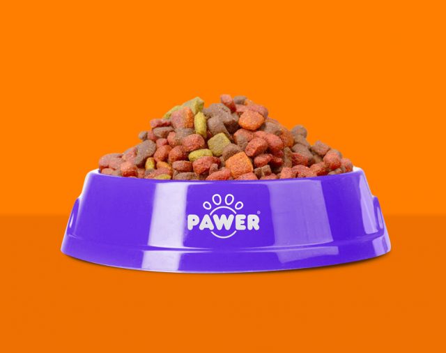
Una marca de croquetas para perro que penetrara al mercado de forma rápida.

Analizando el sector de mercado y la competencia encontramos la importancia del nombre de la marca, debe ser explícito, corto y muy fácil de pronunciar.

Por dirigirse a un sector de mercado medio y medio bajo el arte del empaque se realizó con un enfoque práctico con un mensaje directo para que el mercado lo adopte como un hábito de consumo para su mascota en su hogar. Reduciendo a dos colores protagónicos el empaque sobresale en anaquel para lograr una acción de compra logrando una buena percepción de la marca entre costo y beneficio.

A dog food brand that will penetrate the market in a fast way.

Analyzing the market sector and the competition we found the importance of the brand’s name, it must be explicit, short and easy to pronounce.

By addressing a sector of medium and low-medium market, the packaging art was made with a practical approach with a direct message for the market to adopt it as a habit of consumption for their pet in their home.

Nami Sake

Crear la primera marca de sake mexicano de la historia, producido y distribuido en nuestro país. El reto fue lograr un lenguaje visual dirigido al mercado conocedor de bebidas alcohólicas.

Al hacer un análisis nos dimos cuenta que es un producto de alto involucramiento por el cual necesitábamos contar una historia para generar credibilidad y proyectar al sake mexicano como un producto premium.

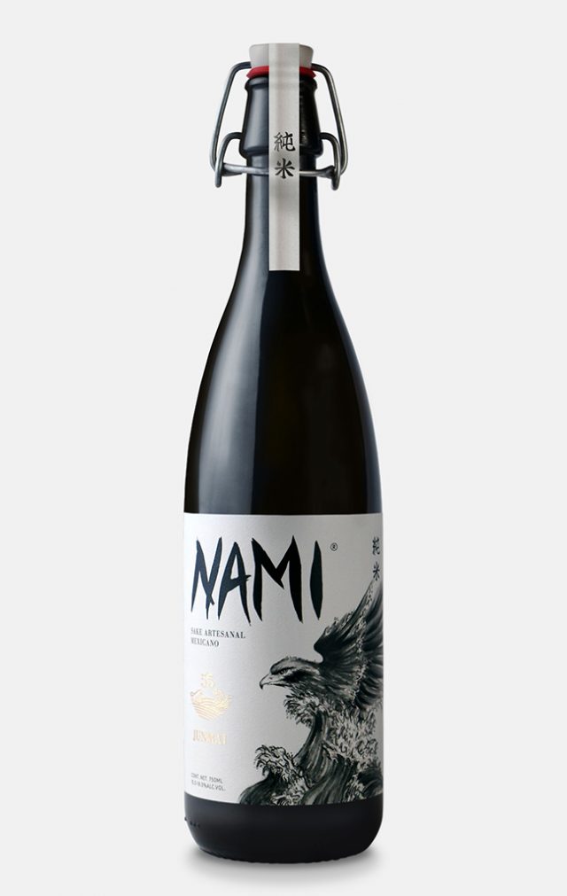
Nami significa ola en japonés, ejecutamos un logotipo con estilo Kanji para ser coherentes con el origen de la marca. El empaque cuenta la historia de la unión de México y Japón por medio del mar y la fusión con un águila, siendo un animal histórico y sagrado para ambas culturas.

Create the first brand of Mexican sake in history, produced and distributed in our country. The challenge was to achieve a visual language aimed at the alcoholic beverage connoisseur market.

While doing the analysis, we realized that it’s a product of high involvement in which we needed to tell a story to generate credibility and project the Mexican sake as a premium product.

Nami means “wave” in Japanese, we executed a logo with a Kanji style to be coherent with the origin of the brand. The packaging tells the story of the union between Mexico and Japan through the sea and fusion with an eagle, being a historical animal and sacred to both cultures.