
Branding

Agua Histórica

Desarrollar una marca premium de agua natural y mineralizada dirigida al mercado de bebidas alcohólicas de alto valor.

Detectamos que el mercado al que se dirige la marca reconoce el tiempo y la trayectoria de los productos de calidad. La estética es muy importante ya que los productos líderes en el mercado manejan un arte elaborado y estilizado.

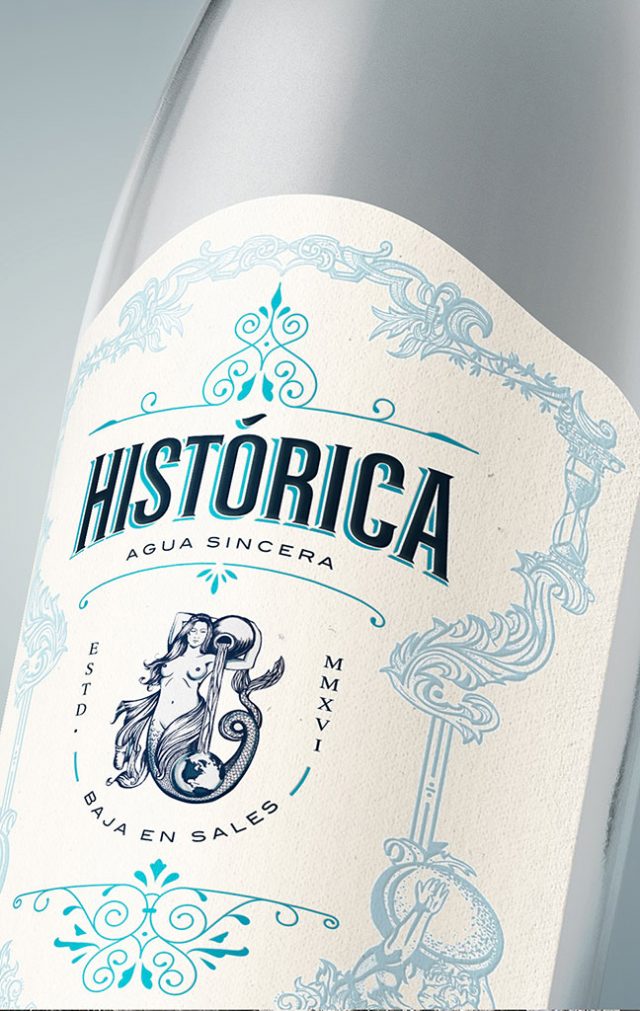
Llamamos a la marca HISTÓRICA, para lograr posicionar al producto desde su primera aparición en anaquel. Justificamos el nombre y el arte de la etiqueta creando un personaje que representa a la mujer de Atlas, figura mitológica que sostiene al mundo.

Histórica es una sirena apasionada por la pureza y energía del agua en el universo.

Develop a premium brand of natural and mineralized water aimed at the high-value alcoholic beverages market.

We detected that the market the brand is targeting recognizes the time and trajectory of quality products. The aesthetic is really important since the leading products in the market manage an elaborate and stylized art.
We named the brand HISTORICA, to achieve a place in the market from its first appearance on the shelf.
We justify the name and art of the label by creating a character that represents the woman of Atlas, a mythological figure that sustains the world.
Historica is a mermaid passionate about the purity and energy of the water in the universe.
Cerveza Pariente

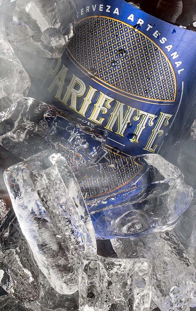
Crear una marca de cerveza artesanal con mucho arraigo regional.

Trabajamos en la creación de un nombre que se identificara en la cultura colectiva Sinaloense en el ambiente social y bohemio.

Se desarrolló la identidad visual del logotipo y etiqueta con un concepto elegante y clásico para contrastar el concepto final del producto, logrando comunicar distinción y empatía en su consumo.

Create a craft beer brand with a lot of regional roots.

We worked in the creation of a name that identifies with the collective culture of Sinaloa in a social and bohemian environment.
The visual identity of the logo and label was developed with an elegant and classic concept to contrast the final concept of the product, managing to communicate distinction and empathy with its consumption.

Los Arcos

Restaurant Los Arcos decide después de 40 años renovar su marca para conquistar nuevas generaciones.

Mediante un análisis de marca se concluye que el logotipo tiene detalles gráficos regionales los cuales son difíciles de digerir culturalmente en el mercado nacional, sobre todo si no se conoce la historia y lugar de origen del restaurante.

No solo era necesario renovar el logotipo, sino también la experiencia física de la marca: desde los menús y la fotografía hasta la personalidad de marca. En el ámbito digital, se diseñó el sitio publicado en 2015 como parte integral de la experiencia de marca, así como la comunicación interna, con el objetivo de transmitir empatía y actualidad en el mercado.

Decidimos volver al origen e inicios de la marca para escribir una nueva historia. El rediseño del logotipo se inspiró en la forma natural del camarón, producto estrella de Los Arcos, volviendo a una posición natural enroscada que proyecta nacimiento y evolución.

Los Arcos restaurant decides after 40 years, to renew its brand to conquer new generations.

Through an analysis of the brand, it’s concluded that the logo has regional graphic details that are difficult to understand culturally in the national market, especially if you don’t know the history and place of origin of the restaurant.

Not only was the logo in need to be renewed, but the physical experience of the brand, like the menus, photography, brand personality, and intern communication, to achieve transmitting empathy and actuality on the market.

We decided to return to the origin and beginnings of the brand to write a new story. The redesign of the logo was inspired by the natural form of the shrimp, the star product of Los Arcos, going back to a natural position that projects birth and evolution.

Hip Water

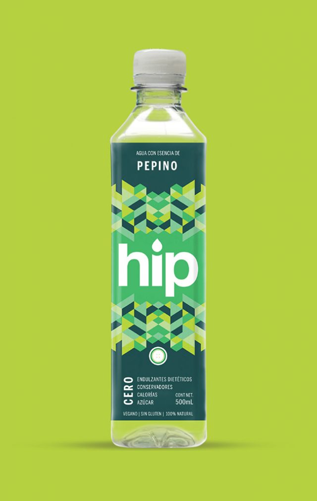
Un nuevo producto en el mercado, agua 100% natural con fusión de frutas sin endulzantes dietéticos, conservadores, calorías y azúcar que desea atacar al mercado de hábitos relacionados con la buena alimentación y ejercicio.

Los consumidores de este tipo de productos son muy visuales, honestos y buscan practicidad en su vida y en los productos que consumen.

Creamos un nombre corto y logotipo amigable, que proyecta frescura. Decidimos intervenir las etiquetas con patrones modernos inspirados en las frutas. Utilizamos transparencias en etiqueta proyectando sinceridad y protagonismo en los colores.

A new product in the market, 100% natural water with fruit fusion without dietary sweeteners, preservatives, calories, and sugar that want to attack the market habits related to good diet and exercise.

The consumers of this type of product are very visual, honest and look for practicality in their lives and in the products they consume.

We created a short name and a friendly logo that projects freshness. We decided to intervene in labels with modern patterns inspired by fruits. We used transparencies on the label projecting sincerity and prominence in colors.

Pawer

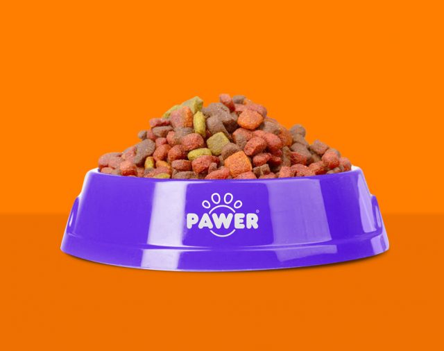
Una marca de croquetas para perro que penetrara al mercado de forma rápida.

Analizando el sector de mercado y la competencia encontramos la importancia del nombre de la marca, debe ser explícito, corto y muy fácil de pronunciar.

Por dirigirse a un sector de mercado medio y medio bajo el arte del empaque se realizó con un enfoque práctico con un mensaje directo para que el mercado lo adopte como un hábito de consumo para su mascota en su hogar. Reduciendo a dos colores protagónicos el empaque sobresale en anaquel para lograr una acción de compra logrando una buena percepción de la marca entre costo y beneficio.

A dog food brand that will penetrate the market in a fast way.

Analyzing the market sector and the competition we found the importance of the brand’s name, it must be explicit, short and easy to pronounce.

By addressing a sector of medium and low-medium market, the packaging art was made with a practical approach with a direct message for the market to adopt it as a habit of consumption for their pet in their home.

Nami Sake

Crear la primera marca de sake mexicano de la historia, producido y distribuido en nuestro país. El reto fue lograr un lenguaje visual dirigido al mercado conocedor de bebidas alcohólicas.

Al hacer un análisis nos dimos cuenta que es un producto de alto involucramiento por el cual necesitábamos contar una historia para generar credibilidad y proyectar al sake mexicano como un producto premium.

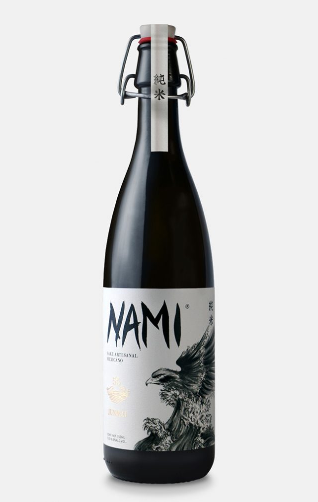
Nami significa ola en japonés, ejecutamos un logotipo con estilo Kanji para ser coherentes con el origen de la marca. El empaque cuenta la historia de la unión de México y Japón por medio del mar y la fusión con un águila, siendo un animal histórico y sagrado para ambas culturas.

Create the first brand of Mexican sake in history, produced and distributed in our country. The challenge was to achieve a visual language aimed at the alcoholic beverage connoisseur market.

While doing the analysis, we realized that it’s a product of high involvement in which we needed to tell a story to generate credibility and project the Mexican sake as a premium product.

Nami means “wave” in Japanese, we executed a logo with a Kanji style to be coherent with the origin of the brand. The packaging tells the story of the union between Mexico and Japan through the sea and fusion with an eagle, being a historical animal and sacred to both cultures.